


How to use Hehkumpi ColorAid color chart card
- Hehkumpi

- Nov 19, 2025
- 8 min read
The Hehkumpi ColorAid color chart card shows comparison points from all color seasons in the color analysis, making it easier to identify your own colors.
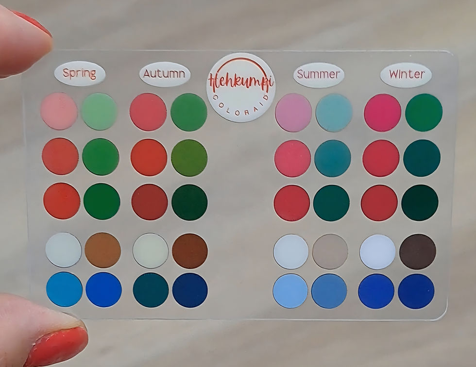
The Hehkumpi Color Analysis ColorAid color chart card has 40 colors per side, total of 80 colors. They are categorized according to the 4-part color analysis: Spring, Autumn, Summer and Winter. However, the ColorAid color chart works for the 4-part, 12-part and 16-part color analysis color seasons.
The basic idea is that whichever color ball disappears best against the fabric or other object being examined, that color family is where the color belongs. Since there are an infinite number of colors and their different shades in the world, finding the exact color to match a color chart or color palette is challenging.

The ColorAid color card has a front and back side, and they aim to achieve slightly different things. As a starting point, try to determine the color family (color season) using the front side of the color card. If you find it difficult to determine, turn the card over and try to think about which color family the color you are studying would best fit into, using both sides.
How to use Hehkumpi ColorAid color chart card to identify color seasons
The ColorAid color chart card is intended to identify the properties of colors, i.e. whether a color is:
Warm, neutral or cool
Bright or soft
Deep or light

Spring color family
The spring color family has the following characteristics:
Light
Warm or neutral
Bright

Light spring
If you are a light spring, you can use ColorAid's spring and summer color families. Light spring should especially avoid the darker colors of winter and autumn.
Warm spring
If you are a warm spring, look at colors from the entire spring color family. If you need additional colors, choose the lightest colors from the autumn color family. Avoid summer and winter colors in particular.
Bright spring
If you are a bright spring, use the entire spring color family. The brightest colors of winter also work. Avoid summer colors and the more muted (softer) colors of autumn.
Autumn color family
The autumn color family has the following characteristics:
Warm or neutral
Soft
Dark (deep/dark)

Warm autumn
If you are a warm autumn, favor all autumn colors and borrow colors from the spring side. Avoid cool colors, such as summer and winter.
Soft autumn
Soft autumn flows towards soft summer, so take advantage of autumn and the colors that fall between summer and autumn from ColorAid. Avoid the bright and cold colors of winter in particular.
Deep/dark autumn
Make use of the entire autumn color family, and you can think of colors as even darker. Avoid summer colors in particular.
Summer color family
The summer color family has the following characteristics:
Light
Soft
Cool or neutral

Light summer
If you are a light summer, take advantage of the whole summer and you can also think of shades that are even lighter. Avoid warm colors in particular, i.e. the colors of spring and autumn.
Soft summer
If you are a soft summer, use the entire summer color family. You can also use shades that fall between the fall and summer color families. Avoid spring colors in particular.
Cool summer
If you are a cool summer, take advantage of the entire summer color family as well as shades that fall between summer and winter. Avoid warm color seasons.
Winter color family
The winter color family has the following characteristics:
Bright
Cool or neutral
Dark

Clear winter
If you are a bright winter, also use the purest (brightest) shades from summer, as well as the brightest colors from spring. Avoid autumn shades in particular.
Cool winter
If you are a cool winter, take advantage of the entire winter color palette. If you need more colors, stick to cool colors and borrow the purest ones from summer. Avoid warm colors, i.e. colors from the spring and fall color families.
Deep winter
If you are a dark winter, you probably have a very neutral skin tone. Utilize the darker shades of winter and fall. Especially avoid the lighter colors of summer and spring.
How to use the ColorAid color chart
The Hehkumpi Color Analysis ColorAid color chart is primarily intended for people who have already had a color analysis. However, the color chart can be used to design harmonious color combinations even if you have not had a color analysis.
Using the ColorAid color chart is easier if you understand the differences in the properties of colors in different color families. On the other hand, you can also use the color chart to simply look at which color family the color you are studying is closest to.

The importance of lighting in color perception
It is recommended to use the ColorAid color chart in the best possible light. Reliable color analysis is always done in good light (as close to natural white daylight as possible).
Of course, the ColorAid color chart is useful even in different lighting conditions. However, although the light is often practically the same for the canvas being examined and the ColorAid, due to the material of the object being examined and the ColorAid and the reflections of the light, the colors can still be reproduced differently in different lighting.
When using the ColorAid color chart and investigating which color family a color belongs to, it is also a good idea to test the color chart at different distances and angles in relation to the color being studied. Depending on the characteristics of the color chart (transparency and printing issues) and the lighting, the colors may reproduce slightly differently.
Always keep a ColorAid color chart with you. For example, when you are a passenger in a car, look at colors in good light, or when you are waiting at the dentist's office, study pictures in magazines with ColorAid. With practice, your color vision will become more accurate!

How do you distinguish between different color families and their characteristics
When identifying colors, it is important to understand that colors have three different properties that together determine the color family and subcategory. These properties are:
temperature (cool/neutral/warm)
brightness/softness
darkness/lightness
I personally think about these properties and their relationships mathematically using metric thinking . The Hehkumpi color analysis ColorAid color chart aims to illustrate these properties and the relationships between different colors.
Color temperature and how to distinguish warm and cool colors
For example, spring and autumn are both inherently warm color seasons. However, not every color in them is 100% warm, like orange, for example.

However, warm colors are at least 50% warm on the temperature scale (a 50% warm color is therefore neutral in temperature and these are suitable for practically all color seasons, but in this example especially for soft autumn, bright spring and light spring).
Winter and summer, on the other hand, are cool color seasons or neutral-cool and their warmth is 50% or below on the heat scale.
Color softness/brightness
For example, winter and spring are bright color seasons and the brightness of the colors in their color families is at least 50%. Soft colors have a softness/brightness scale of 0-50% and are therefore especially suitable for autumn and summer color families.
Lightness/darkness of color
The third color property is the darkness/lightness of the color. Dark color seasons are winter and autumn. For example, dark winter is 100% dark, 50% cool, and 50% bright in terms of color properties, meaning the most important property of colors is darkness. Dark winter can move a little in terms of the other two color properties.
Light color families are spring and summer. Their lightness is 0-50%.

How to interpret the color season using the ColorAid color chart
If the color you are researching falls between two color families on the ColorAid color chart, e.g. spring and winter, think about what the common characteristic of those color families is. For spring and winter, it is brightness and the color probably belongs to bright spring and bright winter. This way you will also find out the subcategory of the color season.
If the color properties are very neutral, then the color being studied is very likely to be suitable for several seasons. For example, if the color is very neutral in brightness and darkness and the temperature is clearly on the warm side, then the color is likely to be particularly suitable for (warm) spring and warm autumn.
You can also evaluate a color using the exclusion technique. Ask yourself if the color is:
dark or light
bright or soft
warm or cool
Depending on which characteristic you identify, you can rule out others. For example, if you identify a color as warm, it cannot be a color in the winter or summer color family and you can rule those out from the options. Then if you identify brightness, rule out autumn and since warmth was the most dominant characteristic, then the color is basically best for a warm spring.

Colors of the ColorAid color chart
The Hehkumpi color analysis ColorAid color chart has accent colors in the top three rows that bring color to the outfit, and four neutrals in the bottom two rows that give the outfit a sense of calm.
The colors in the Hehkumpi color analysis ColorAid color chart are based on the 12-part color palette system commonly used in Finland. However, the colors in the ColorAid color chart are not generally found directly in the color palette, because the ColorAid color chart is not intended to find an exact color (e.g. the right shade of green shirt for autumn).
With ColorAid, you can evaluate color families according to 4-part, 12-part, and 16-part color analysis.

The colors in the Hehkumpi color analysis ColorAid color chart have been chosen as so-called limit values. The colors chosen for one color family aim to describe the range of different properties of the entire color family using metric thinking.
The colors may not be the most typical colors for certain color families, such as olive green for autumn and bright pink for winter. The ColorAid color chart aims to identify colors outside of these typical colors.
The core idea of the ColorAid color chart from Hehkumpi color analysis is, in all its simplicity, that it allows you to see comparisons from all color families at once. This makes it easier to determine the color family of a color.
If you don't have your own ColorAid color chart yet, order it from our online store and make shopping trips and color identification easier in the future!
If you have any questions or comments about Hehkumpi ColorAid, please write below!

Comments